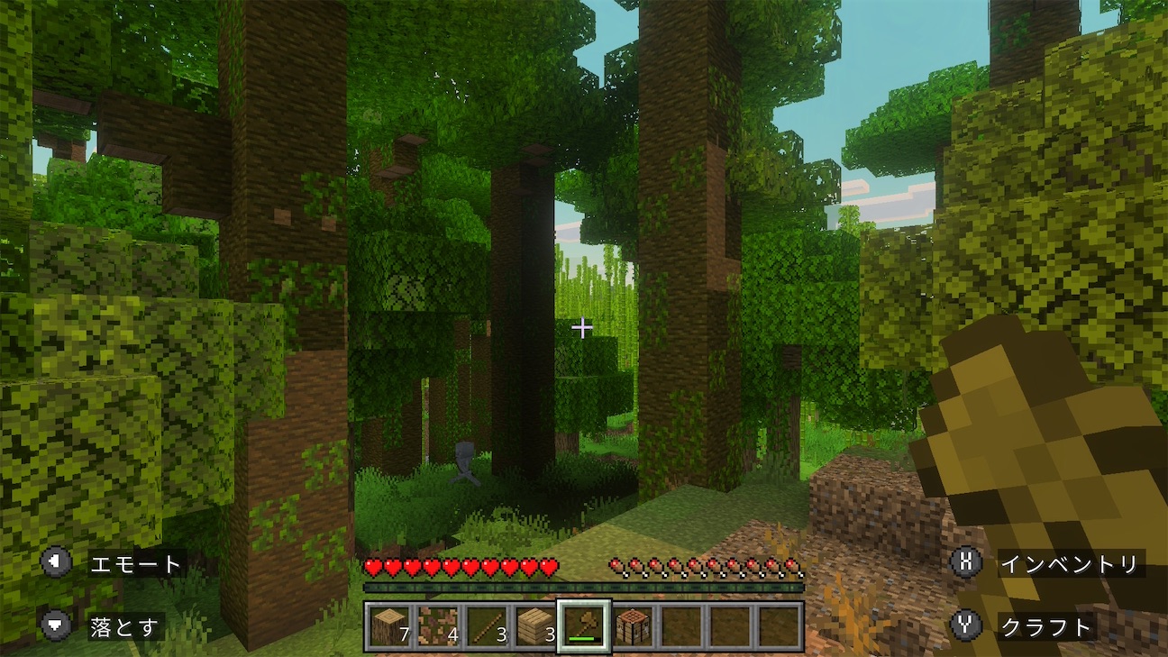
This is an English version of an essay originally written in Japanese.
Even if you love games, there are times when you catch yourself thinking, "Everything I play lately is fun enough, but nothing really moves me." I suspect everyone has wondered at some point whether they have lost the passion they once had. Until two weeks ago, that was me. It was one of those slumps that come around now and then. I told myself the passion would probably return someday, but somewhere inside I was uneasy.
And then a single game can turn that feeling upside down. My passion for games came back, and the game that brought it back is Queen's Domain. It comes from a tiny studio with just two core developers*1, but it was so good that I set aside the remake of The Legend of Zelda: Ocarina of Time to play it. I have finished Ocarina at least twice already; it could wait. Queen's Domain felt like the only game I should be playing right now.
I had somehow missed it, but the 2025 demo had apparently already caused quite a stir. The full version came out this year on October 30 (October 31 in Japan), and the excitement has been spreading among players on social media like a quiet swell. The game may not be widely known yet, but I believe this masterpiece will leave a great mark on the history of indie games, much as Stardew Valley did in 2016. It feels like a place I had been waiting for all along, almost like coming home. It is a work I hold very dear.
The main aim of this essay is to raise a question—can the ways we usually evaluate how a video game looks really do justice to Queen's Domain?—and to propose an answer. My answer is that we should value something simpler: enjoying the incongruity that the game's look produces, at the level of sensation, simply as incongruity.
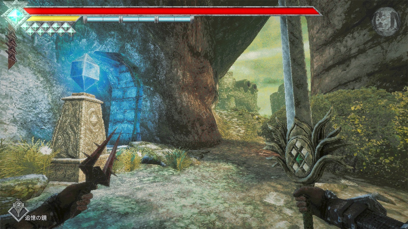
For the record, I am about 51 hours in (by the in-game clock) and have just reached Ending 2. I got Ending 1 on my own; for Ending 2 I wandered for nearly ten hours, gave up, and looked up a guide.
Perhaps because more people have now finished it, I have recently begun to see the verdict that "the second half is a letdown; the game runs out of steam." I understand this well, and I think it is a fair assessment. The likely causes are the sudden difficulty spike in the second half (from the Ancient World onward) and the fact that you cannot progress without solving a great many puzzles that come with barely any hints. Still, I want to call the game a masterpiece, late-game design included. One of the aims of this essay is to show the distinctive value of that second half.
A Pleasure Close to Metroid Prime
Queen's Domain is a first-person action RPG. Whenever it is introduced, the game invariably brought up is FromSoftware's King's Field (1994). As the title makes plain, it is an homage to King's Field, a 3D action RPG released for the original PlayStation.
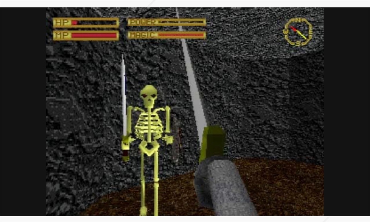 King's Field (1994, FromSoftware), from the official page
With its first-person view and very plain look, King's Field struck me back then as forbidding. Nothing about its appearance was inviting; it kept you at a distance. Perhaps for that reason I did not play it until long after release, and even then I skipped the first game and jumped straight to the second, King's Field II (1995). (I am using the Japanese numbering here. The first game never left Japan, so the West knows II and III as King's Field and King's Field II, and IV as King's Field: The Ancient City.) In the end II was the only one I played; I never touched the first game, King's Field III (1996), or King's Field IV (2001). That is because II was too hard for me, and I gave up partway through. Wandering forever through gloomy, oppressive dungeons, killed again and again without ever feeling I was getting stronger—that unforgiving experience wore me down. I could not have imagined then that more than ten years later I would fall for Demon's Souls (2009), from the same FromSoftware, and the Souls games that followed. But the fact that I had given up on it stayed with me all those years.
So when I heard the buzz around Queen's Domain, I thought: maybe this is my chance to avenge that defeat. And three hours in, I was hooked. I did think "This is hard!"—but what surprised me was the thrill of "How playable this is!" On English-language social media, two titles often mentioned alongside it are The Elder Scrolls III: Morrowind (2002)*2 and Metroid Prime (2002). I have not played Morrowind, so I cannot speak to that, but I understand very well the urge to bring up Metroid Prime. Its combat built around gun-like ranged weapons and its sci-fi setting have little in common with the medieval-fantasy Queen's Domain, yet the feel of playing is strangely close. I, too, found the pleasures of exploration and progression in the two games very much alike.
The Distinctive Charm of Queen's Domain Lies in Incongruity
The most distinctive thing about Queen's Domain as a work is surely how it looks. Because three King's Field games came out on the original PlayStation, people often say it "looks like a PS1 game," but it is actually closer to the PS2. It probably most resembles Eternal Ring (2000, FromSoftware) or King's Field IV.
Either way, this retro, low-poly 3D look is an important feature of the game. But what does the look actually do for our enjoyment of it? Obviously it is an homage to King's Field, and it works to evoke a kind of nostalgia. But what matters, I believe, is that the look of Queen's Domain does not merely evoke nostalgia; it delivers a "pleasure of incongruity." What made so many people greet this game with surprise is its high level of hospitality, so at odds with its retro look. At first you wonder whether it is too hard, but play a little and you start to see how to dodge enemy attacks. Even the overpowered laser attacks gradually become manageable. Queen's Domain is a game that is very good at playing host. That early-game joy reaches its first peak when you beat the first boss and claim the Holy Sword. Metroid Prime, too, was memorable for how polished its hospitality was.
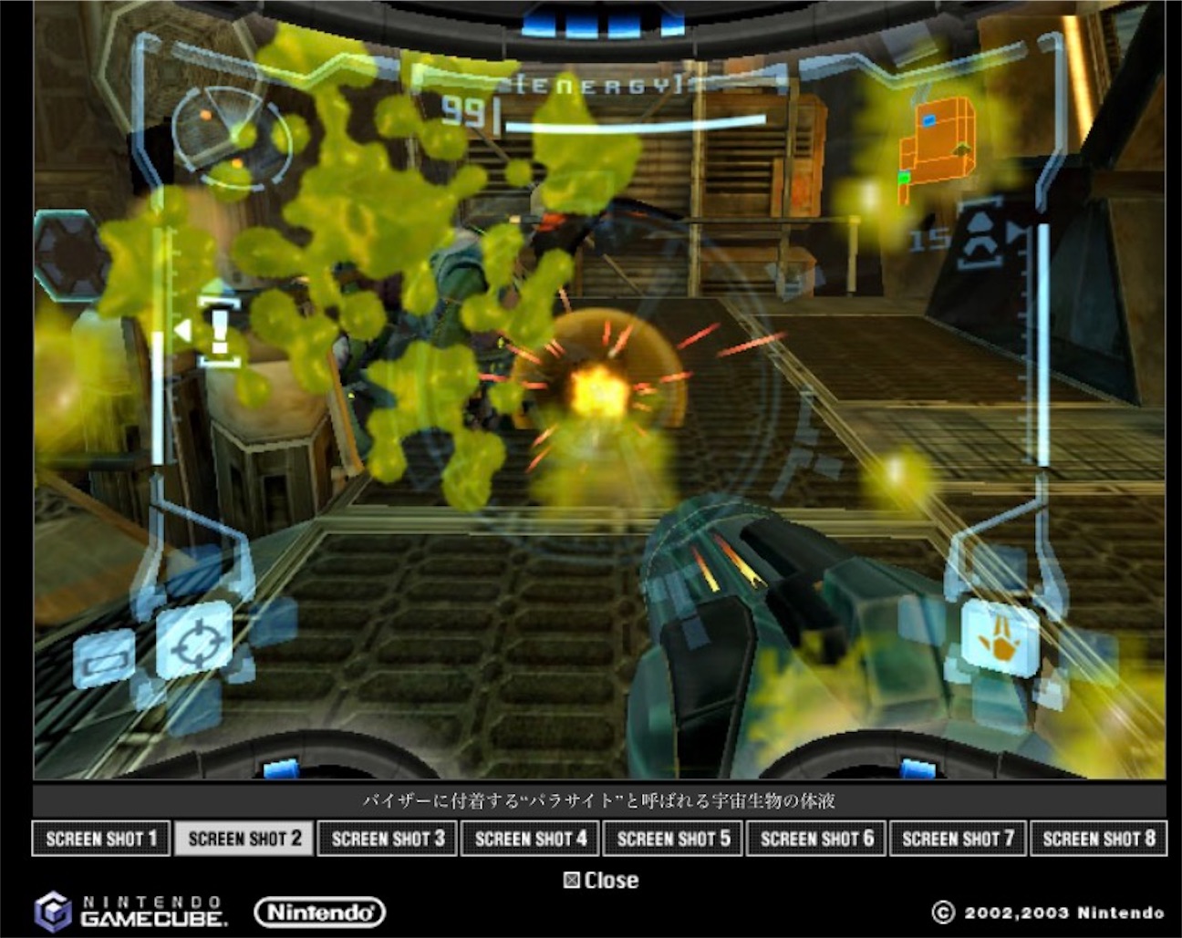 Metroid Prime (2002, Nintendo), from the official page
As everyone says, this game is "well made." It is easy to play and highly polished as a game. And isn't that exactly why its low-poly look, as incongruity, works to amplify the pleasure? That is the claim of this essay. Put simply, it is the thrill of "It looks like this, and yet it treats us with such modern hospitality?"
This makes me imagine that when indie games rose to prominence in the 2000s, their pixel graphics and lo-fi visuals may likewise have worked positively as a kind of incongruity. That may sound obvious. I insist on it anyway because I feel that pixel art has rarely been talked about that way, then or now.
What do I mean? Let me explain in a bit more detail in the next section.
Why Is Pixel Art Good?
In the previous section I focused on the "incongruity" we feel from a retro look. My reason has a lot to do with how we have evaluated retro looks over the past twenty years, especially since indie games took off. We gamers, surprisingly, have not really said, "It looks old, and yet it's this much fun." In other words, I think we have seldom paid attention to incongruity.
So here I would like to take up two opinions about the indie classic Cave Story as typical examples of how pixel art gets evaluated.
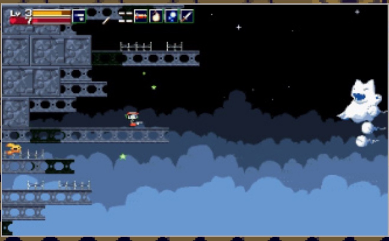 Cave Story (2004, Studio Pixel), from the official Pikii page
First, an opinion on Cave Story written in 2005*3.
As you can probably tell from the title screen above, the graphics are like something from the Famicom days. I think it stands in sharp contrast to the games now rampant on consoles, the kind that may pour effort into graphics but make you want to ask, "And what about the content?" To my mind, what matters more for a game than whether its graphics are detailed and pretty is that the various objects in it are easy to tell apart. So if anything, I find graphics like these easier to read, and better. What do you think?
PCあるなら洞窟物語 ("If You Have a PC, Play Cave Story"; in Japanese, my translation)
The first half argues that effort should go into content rather than lavish looks. What I want to draw attention to is the second half: the claim that Cave Story's retro look has the merit of making "objects easy to tell apart," and so works positively, functionally, for gameplay. The idea here is that "the pixel-art look performs the function of enhancing gameplay, and is valuable for that reason." In this essay I will call this A. the functional view.
On the other hand, some opinions value retro-looking graphics as something independent of gameplay. These, too, can be found from around the same time.
What I quote next is a 2006 discussion on the Inside Mac Games forum. In response to a review that rated Cave Story highly*4, someone made the following negative comment.
How the hell does this game get a 9 for graphics? For a while I've been skeptical about insidemacgame reviews because I felt they were too generous, but this takes the cake. In no way am I saying this is a bad game, I enjoy it very much, but how can I use reviews to compare games when a game like this merits the same graphics rating as call of duty 2? Maybe it has good graphics for its particular genre or style or whatever, but why not just admit the fact that its nothing pretty to look at and focus on complimenting the gameplay?
Inside Mac Games Reviews Cave Story: Doukutsu Monogatari
An unnamed critic's comment, as quoted in a post by Sharky (December 14, 2006, 9:51 PM)
In reply, Sharky, who by his own account wrote the review, quotes the following passage from it.
The title is old school to the core. The art is pixel graphics in the 8-bit fashion, but very sophisticated. There’s a lot of scope in the art of the game and all the environments and characters are well rendered. Many reviews and reviewers will dock the game for not looking better or more modern, but that’s not the point at all.
What this exchange has in view is the excellence of 8-bit-style pixel art in itself. While some think Cave Story's graphics do not look good, pixel art is held to have a beauty and value of its own, and that is what is being celebrated. On this view, what makes pixel art wonderful is not whether it contributes, as one function, to what makes the work a game. Pixel art is good because it is beautiful in itself.
In Media Arts Current Contents, a site run by Japan's Agency for Cultural Affairs, the aesthetics and game studies scholar Shinji Matsunaga gives several examples of pixel art and writes that they
show that pixel art is being received in its own right—that is, as pictures that stand on their own rather than as graphics attached to a game.
Shinji Matsunaga, "The Aesthetics of Pixel Art, Part 1: What Is Pixel Art?" (in Japanese, my translation)
To distinguish it from the functional view above, I will call this idea of valuing the art "as pictures that stand on their own" B. the intrinsic-value view.
The Incongruity Hypothesis
Set against these two views, what I want to argue can be restated as follows.
From the 2000s to today, I believe, pixel art and retro graphics have been evaluated mainly in one of these two ways: A, the functional view, or B, the intrinsic-value view. But might there be a third way? That is C. the incongruity hypothesis. On the incongruity hypothesis, retro graphics can be valued even if they have no function that contributes to gameplay (unlike A). And they can be valued even if they cannot be called beautiful in themselves (unlike B). What it points to is an amplification of pleasure, brought about by an incongruity, something like cognitive dissonance, between a welcoming, convenient modern game that takes excellent care of the player and the look of an old-fashioned, inhospitable, inconvenient retro game. Thanks to that incongruity we enjoy the game more, for reasons we cannot quite pin down. That is the incongruity hypothesis.
As I see it, this incongruity is not itself fun or pleasurable. Yet somehow it has the function of amplifying the fun of the game. The enjoyment of Queen's Domain clearly seems to involve such a mechanism. It is not just that Queen's Domain is fun because it is well made. I have no quarrel with the claim that it is a polished and enjoyable game. But the fact that it leaves some special impression beyond its polish is, I suspect, owed to the incongruity between its look and that polish.
Indeed, try imagining a remake of Queen's Domain with the game systems left exactly as they are but with fully realistic, high-resolution visuals. Doesn't it feel as though something would be missing? I do not think that is simply because the nostalgia would be gone. Rather, I think that with the loss of the incongruity we had been feeling as we played, part of the switch that had been amplifying our pleasure gets turned off.
Reading Queen's Domain Through the Incongruity Hypothesis
Now let us think concretely about the look of Queen's Domain, applying views A through C in turn.
First, A, the functional view. It is hard to argue that this look makes the game's systems easier to play, or that it fosters a sense of challenge. About the most one could say is that the retro look lets the monsters, whose designs seem almost slapped together (the Ratty Bug!), blend nicely into the cheap-looking scenery. When visuals are said to contribute to gameplay, the usual terms are those of the Cave Story opinion above—"objects are easy to tell apart"—or, for games with cutting-edge graphics, "high resolution makes distant objects easier to see" or "it is immersive." Queen's Domain fits none of these well. It has neither a 2D-style overhead view nor simple visuals with a limited palette, and in 2026 it is not realistic enough to be immersive. Its visuals are too in-between to defend on functional grounds.
What about B, the intrinsic-value view? This is exactly the case where the look of Queen's Domain is valued as nostalgia: the reading that takes nostalgia itself, like beauty, to be an autonomous value that brings a kind of pleasure. But if we explain the appeal of these visuals by nostalgia, there seem to be a good many cases it does not fit. For one has to ask: is this game really being valued out of nostalgia? I, for one, have hardly played King's Field. I gave up on II after a mere ten hours or so. I have next to no attachment to King's Field that could make me nostalgic. That I nonetheless enjoyed Queen's Domain this much suggests nostalgia does not actually contribute much to the enjoyment. I also suspect that a considerable number of the people praising this game have never played King's Field in the first place. The series has not been ported to current hardware or to Steam, and playing it today takes real effort*5. Of course, the "nostalgia" need not rest on the King's Field series alone. Many people are reminded of other 3D games of the 2000s, such as the Morrowind mentioned earlier. But it is not at all clear what this value of "evoking nostalgia" actually amounts to. If it were simply a matter of feeling nostalgic at the sight of the game, then just looking at the screen would be enough, and there would be an intrinsic value in that—which is surely not the case. If it is the slow-motion-like swing of the sword that evokes nostalgia, then merely swinging the sword around should offer some intrinsic value of its own. But does it really? I cannot deny that the game makes people feel nostalgic. But I doubt that those who rate it highly would themselves say that nostalgia is what earns it such high marks.*6
Then let us set nostalgia aside and consider, more plainly, valuing the visuals of Queen's Domain as "pictures that stand on their own." This turns out to be harder still. With pixel art, the idea that the picture itself is beautiful is a widely recognized value, but it is still hard, for now, to think of low-poly visuals like those of Queen's Domain as "beautiful in their own right." How these visuals are beautiful, how they are attractive, is very hard to put into words. I am not saying it is impossible. Many people feel nostalgic at the sight of them and like them. But how many would flatly call them "beautiful"? This is the big difference from pixel art. These days the sense that pixel art is beautiful in its own right, something to be cherished, is widely shared, and as we saw, its intrinsic value, the idea that it is not merely old-fashioned but beautiful in itself, was already being voiced in 2006, twenty years ago. I rarely come across anyone talking about low-poly 3D that way today. I will not pursue the reasons here. I will say only this: once visuals like these become more widespread, criticism discussing them grows, and a culture of receiving them as pictures in their own right takes hold, it is quite possible that low-poly 3D like that of Queen's Domain will come to be valued on the intrinsic-value view. My sense, though, is that the time has not yet come.
Finally, C, the incongruity hypothesis. This is what I have been saying all along. Queen's Domain is a polished, flat-out fun 3D action RPG. But that is not all. Completely at odds with that polish, its look alone is the low-poly 3D of the 1990s and early 2000s. Compared with today's games, the games of that era were inhospitable, and their systems were often inconvenient. We do, to be sure, partly enjoy that as "nostalgia." More than that, however, the quality of a modern game and the retro impression of the look give rise to an "incongruity." This incongruity makes the "this is fun" we feel each time we make progress register as worth more than we expected. That is because the incongruity has a curious effect: we cannot help being led by the retro visuals into lowering our expectations of "hospitality" and "polish." The rebound from that pushes our estimation of Queen's Domain up in the opposite direction. In other words, what really matters may be not nostalgia but the "incongruity" that comes before it. That is the incongruity hypothesis.
How Is This Different from Defamiliarization?
Having read this far, some readers may wonder how the incongruity hypothesis differs from what criticism calls defamiliarization. I think the two are different, and I would like to explain why.
In her introduction to critical theory, Hihyō riron nyūmon: "Furankenshutain" kaibō kōgi (An Introduction to Critical Theory: Anatomy Lectures on Frankenstein; Chūkō Shinsho, 2005), Yumiko Hirono explains defamiliarization as follows.
To strip familiar things of their everydayness and cast a new light on them is called "defamiliarization."
Part I, 12, "Defamiliarization" (my translation)
Hirono goes on to explain concretely how the novel Frankenstein defamiliarizes that most familiar of things, the human being. Humans are so familiar to us that we ordinarily find nothing strange about them. But when Frankenstein's creature sees a human for the first time, he describes the man's appearance as "different from any I had ever before seen." That is hardly a thought one would have in the ordinary course of life. But the creature is a being whose birth and origins are utterly unlike those of ordinary humans, and from his vantage point that is how humans look. And the work is written so that the reader can understand that alien point of view. This is defamiliarization*7.
The incongruity hypothesis I am describing is something more matter-of-fact and intuitive. Defamiliarization makes the familiar look different and thereby foregrounds some other, essential feature we had not been conscious of (the cruelty or coldness of human beings, say). The incongruity hypothesis has almost nothing that prompts that kind of reflective thought. It simply stresses the surprise of "what came out was not what I expected." That may seem a shallow assessment, with no depth at all. But I think that shallowness is exactly what deserves attention, and that it explains what is going on far more simply than something like "nostalgia" does.
The Incongruity Wears Off
The incongruity hypothesis says something very simple: the appeal of Queen's Domain was surprise. Incongruity is surprise, unexpectedness. And this lets us predict a certain future: the incongruity will wear off before long. Suppose Queen's Domain becomes an even bigger hit and goes mainstream. Many imitators may follow. In that future, the incongruity hypothesis will probably no longer apply, because that road will already have been walked by a great forerunner, Queen's Domain itself. Those who have played it will expect the same polish and hospitality from the next game in its mold. By then, any chance of feeling an incongruity between look and polish will have been worn away completely.
I want to return to one sentence in the Cave Story review quoted on the Inside Mac Games forum above.
Many reviews and reviewers will dock the game for not looking better or more modern…
In 2026, would anyone write this about a pixel-art game? Hardly anyone, I suspect. That is how accepted and ordinary pixel-art visuals have become. Today almost no one—no one among gamers, at least—feels any incongruity between pixel art and refined game systems (mechanics). That is how far the times, and gamers' sensibilities, have moved. And this does not apply to pixel art alone. A future in which low-poly 3D visuals like those of Queen's Domain become commonplace before long is easy to envisage.
Against this wearing-off, however, I think Queen's Domain delivers a powerful counterpunch. This is why I consider it a masterpiece that may hold value beyond its time. The counterpunch is found in the endgame. I will close by explaining this point.
The Late-Game Difficulty and Its Appeal
Queen's Domain takes surprisingly long to play. It took me 51 hours to reach Ending 2, and about 15 of those were spent solely on getting Ending 2. That is, reaching just one more ending after finishing the game once took nearly a third of my total playtime. Why did the endgame take so long? Simply because it was hard. But the nature of that difficulty is what makes this game hard to evaluate. Endings 2 through 4 in particular are not hard in a way you overcome by honing your skills; they are hard in a way that demands patience, doggedly combing the map from end to end. In other words, the game is not asking the player to rack their brains or come up with something clever.
About this second-half turn, I saw the following comment on X (Twitter), and I imagine many FromSoftware fans nodded deeply.
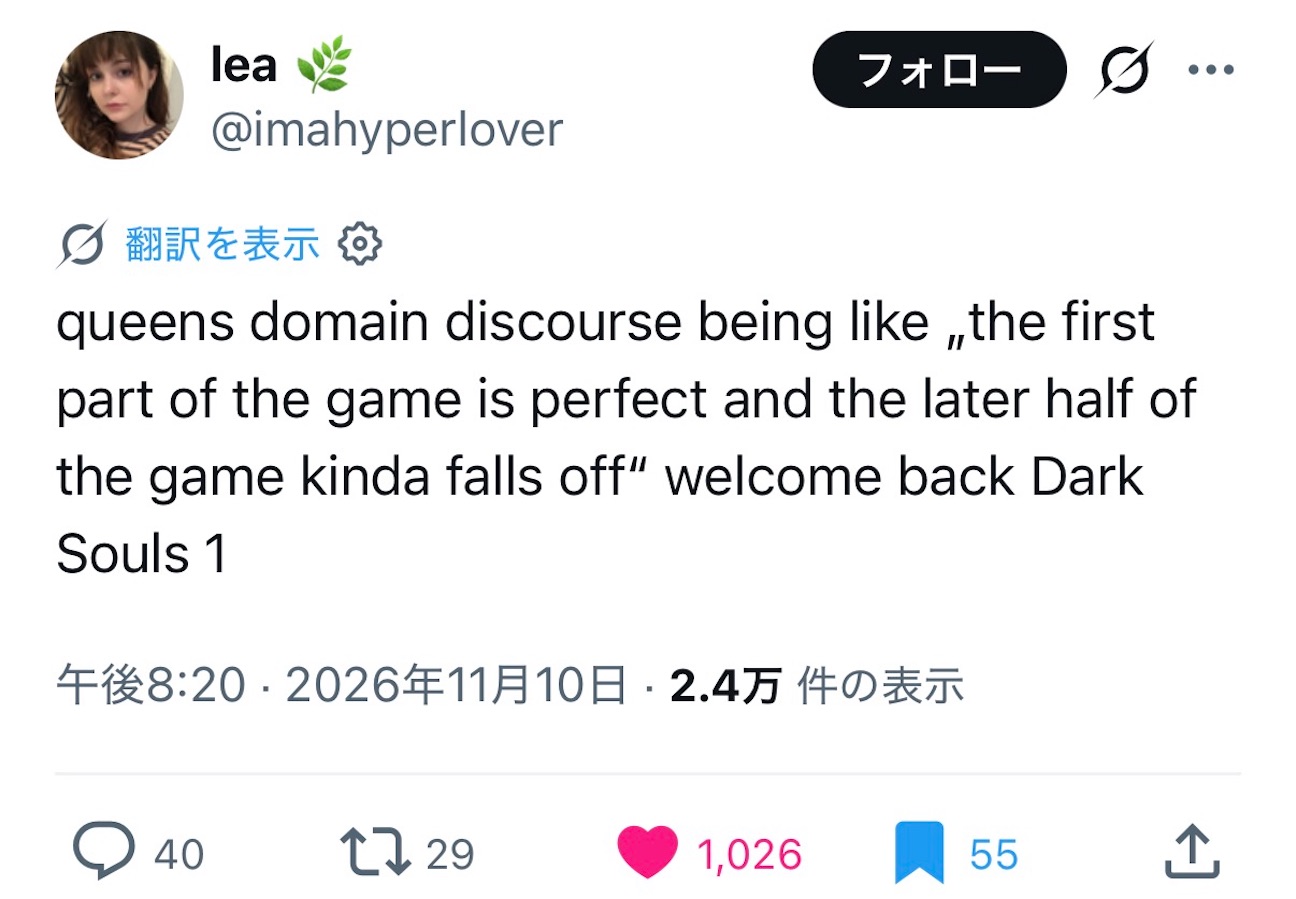 https://x.com/imahyperlover/status/2120114356541063251?a=Mp4E7vF-39VR2E6garU&s=20
So far I have mentioned King's Field in connection with Queen's Domain, but not Dark Souls, made by the same developer, FromSoftware. Yet, as this tweet says, a closeness to Dark Souls is strongly felt in Queen's Domain. It is plain to see in the way you can stray into high-difficulty areas at the very start of the game, bewildering newcomers. And above all there is the second half. I expect many players feel in the second half of Queen's Domain the same thing they felt in Dark Souls past the area called Anor Londo, where the difficulty suddenly climbs and you come close to disliking the game a little. As the tweet says, in the second half the hospitality shown in the first half recedes, and all at once you get the somewhat rough-seeming difficulty spikes and tedium that retro games used to have. But this, I believe, is precisely the game's appeal: complex, impossible to contain in any simple verdict, and likely to stay in many people's hearts.
Why?
Because, as I have argued, in its first half this game captivates the player largely through "incongruity." From the surprise of "how modern the fun is, despite the retro look!", it swerves abruptly, and in the second half and the endgame it shows an almost eerie inhospitality of the sort 1990s games had. It hands the player hunts for huge numbers of collectibles that seem like nothing but a chore, and enemies so tough and strong that at first glance you want to suspect the game has broken. With that, the incongruity that had been there rapidly dissolves, and the look and the game systems mesh as never before. The game stands revealed as an uncompromising thing that will never treat us as guests.
What makes Queen's Domain great is precisely that in the endgame it inflicts, without the slightest reserve, the pain of making the player snap, "Who has time for this?!" One could certainly argue that the game's design simply became less polished in the later stages of development. But I cannot help thinking this is thoroughly deliberate game design. That is because Ending 2 is the standard good ending, the one you would want everyone to play through to. Most players cannot bring themselves to stop at the bad ending, Ending 1. Yet when you set out for Ending 2, the hintless, inhospitable way the game proceeds starts to make you uneasy. The mood is utterly different from the first half, which stayed so close by the player's side. That this was built in not from Ending 3 or 4—endgame-style extra innings for those who love the game—but from Ending 2, the legitimate ending, makes it impossible for me not to sense clear intent on the developers' part. Queen's Domain is trying to say this in the end: the truly great retro games of the past "do not exist to take care of you." Retro games are not conveniences that exist to coddle the player and lead them by the hand. They are great precisely because they are rough and arrogant. At first the game makes you feel an incongruity between its retro look and its gameplay; then, toward the end, that gap gradually closes. This way of being, something like an eternal recurrence—this is the true, fearsome nature of nostalgia. The reason Queen's Domain deserves to be talked about for a long time to come, without ever wearing off, lies precisely in the design of this endgame, with its built-in hardship that can at times be called a loss of steam. If there is such a thing as a queen's garden—haughty and arrogant, yet great and beautiful—then this game, which packs the full swing of that incongruity into a single work, must be that queen's domain.
*1:Freshly Baked Games.
*2:Judging from this AUTOMATON article (in Japanese), the influence of Morrowind reads as something the developers themselves acknowledge, although the article does not say so in so many words.
*3:It was written close to the game's official release, probably in early 2005.
*4:The review itself now returns "not found" and no longer seems to be available.
*5:As this article on note, a Japanese blogging platform, explains, there is no way to play the King's Field series on PS4 or later hardware.
*6:That said, many indie games in the so-called King's Field-like vein were released before Queen's Domain. Lunacid (2023, KIRA LLC / CRITICAL REFLEX) and Verho - Curse of Faces (2025, Kasur Games) seem to be the well-known ones. I have played neither, but both appear to sit at over 90% positive on Steam, so perhaps the format itself has an appeal of its own. If so, my hypothesis may well deserve to be refuted before long.
*7:Brecht's Verfremdungseffekt and Shklovsky's ostranenie differ, I think, in both their claims and their emphases, but for now I will follow Hirono's account.